tavern App
Every week, tabletop RPG players go looking for a group online, and most of them end up in the wrong one. Tavern makes playstyle compatibility visible before the first session, using a scenario-based Vibe Check that turns how you actually play into a visual fingerprint. This case study covers what I assumed, what the data broke, and what I built instead.
Product Design

Project Overview
Client: fictitious
Industry: Social
Timeline: 12 weeks (2025-2026)
My Role: Product Designer
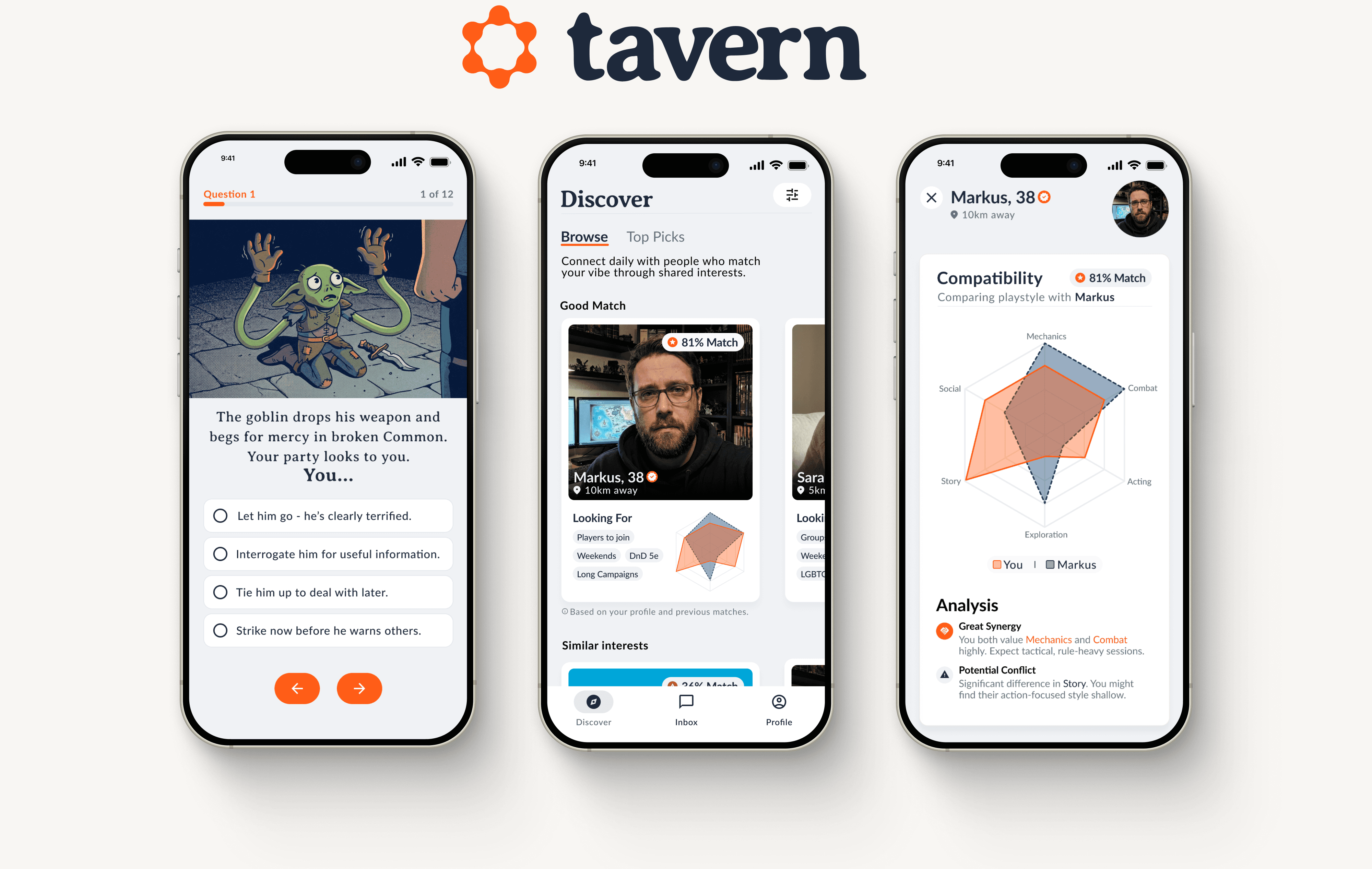
The group finder that doesn't exist.
Tabletop RPGs need something rare: a group that shows up consistently, trusts each other, and enjoys the same things at the table. Finding that group is where it falls apart.
I surveyed 149 TTRPG players to check my assumptions:
71% said scheduling and coordination is their #1 frustration
47% named unreliable players as a major pain point
34% only discover playstyle mismatches after sitting down at the table
61% only search within their existing friend circle
"You spend weeks prepping a campaign, and then players treat it like a backup plan for when nothing better comes up."
— Game Master, survey respondent
Players scroll through Reddit, Discord, and Facebook simultaneously, finally find a group, and realize within twenty minutes that the chemistry is off: one person wants tactical combat, another wants dramatic character arcs. That gap between how much the game means to you and how much it means to the person across the table is what kills groups before they start.

I was building the wrong thing.
My first instinct was the obvious one: build a marketplace. GMs post listings, players apply. It's how StartPlaying and Roll20 LFG work.
But my survey data told a different story. GMs are already drowning in unfiltered applications. They don't need more applicants, they need better ones. Another listing tool doesn't solve the problem, it just moves it.
That changed everything. I scrapped the marketplace model and focused the product on one mechanism: a personality-based matching system that makes compatibility visible at a glance.

Tavern pairs players based on playstyle compatibility, not just availability. At its core: the Vibe Check, a scenario-based assessment that maps players across six dimensions and visualizes the result as a Radar Chart.
Honest data, zero boredom.
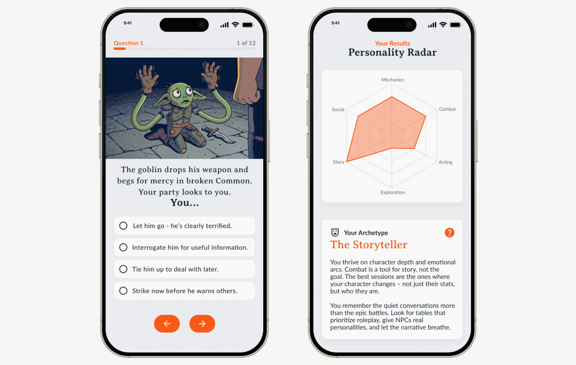
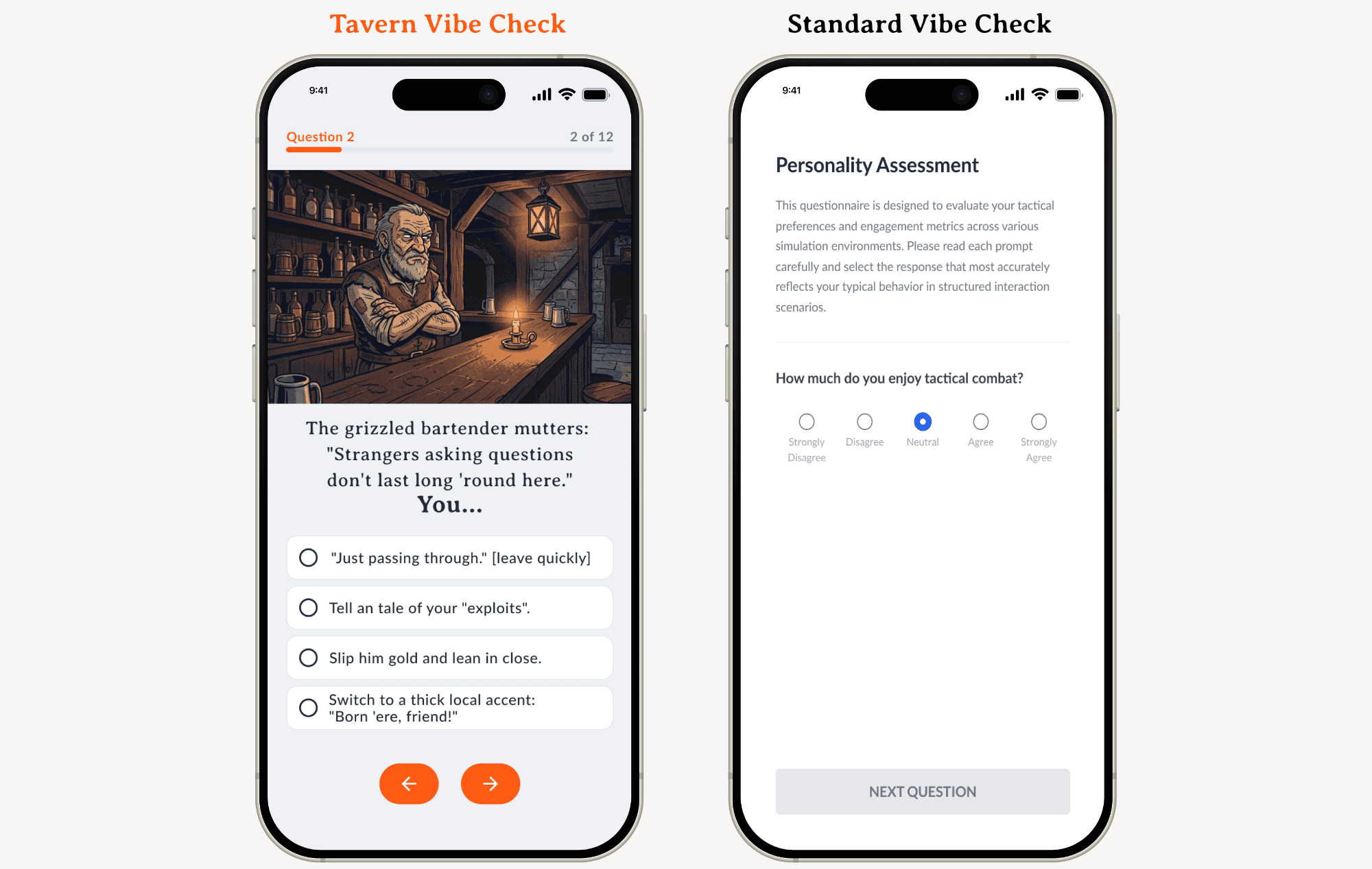
Personality quizzes that ask you to rate yourself invite Social Desirability Bias: people answer who they want to be, not who they are. Tavern uses concrete scenarios instead. "The goblin surrenders, what do you do?" Players react instinctively, which produces more honest data and doubles as onboarding that feels like gameplay, not a form.
Making the invisible visible.
Twelve scenario questions map to six dimensions (Mechanics, Combat, Acting, Exploration, Story, Social), producing a Radar Chart plus an Archetype (e.g. The Storyteller). Players see their own playstyle as a shape for the first time, the foundation the whole matching system runs on.
Compatibility in one glance.
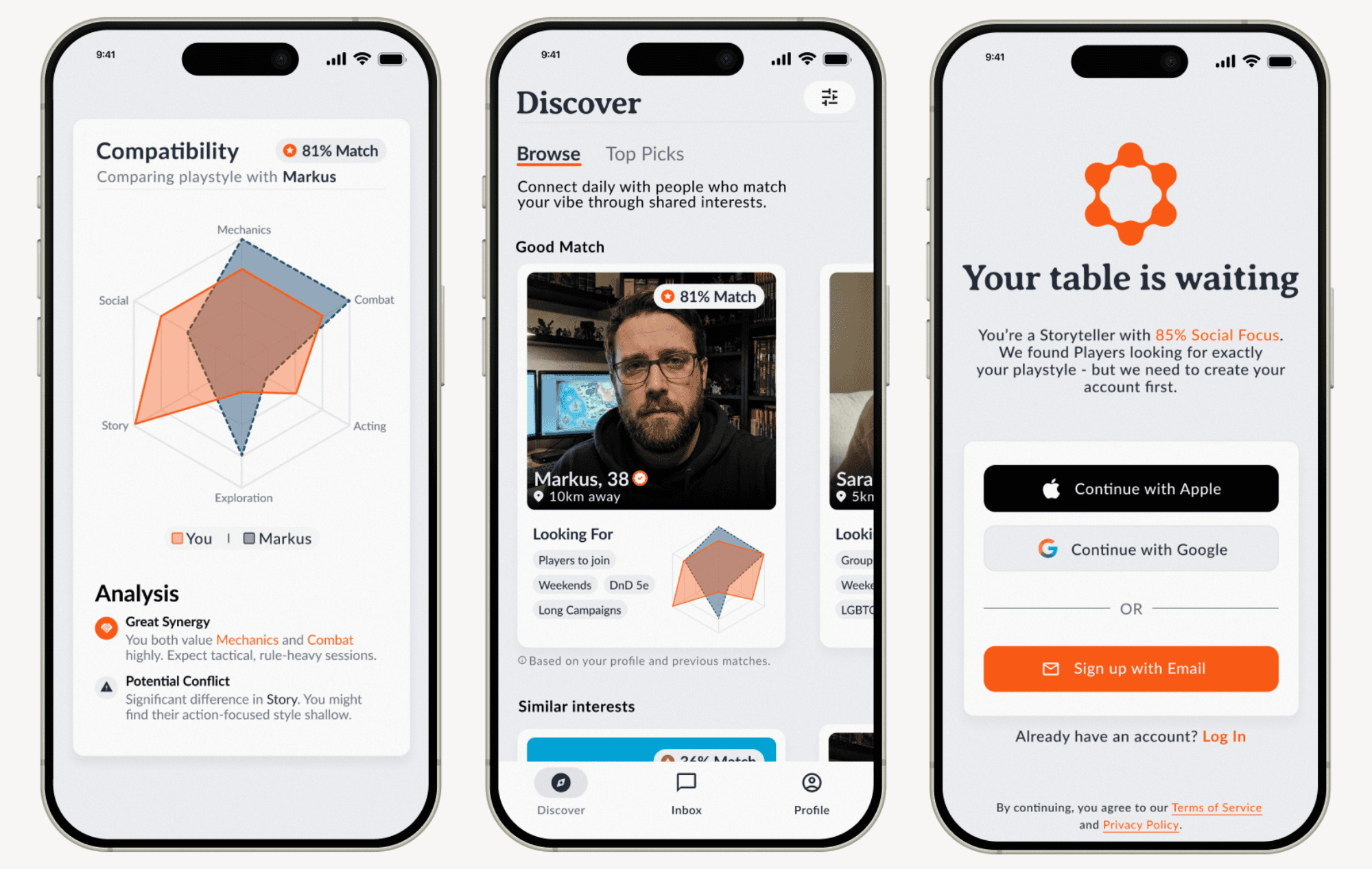
Match Radar Charts overlay (orange vs. gray). The more they overlap, the higher the compatibility. Pattern recognition replaces reading paragraphs and guessing. A numerical Match Score backs it up for anyone who prefers numbers.
Depth over speed.
Tavern avoids the infinite swipe dating apps popularized. Profiles are vertical, scrollable cards that force users to actually engage with playstyle and bio before deciding. For a product optimizing for long-term group commitment, that friction is a feature.
No wall before the door.
Most apps ask for an account before you've seen any value. Tavern flips that: you complete the Vibe Check, see your Radar Chart and Archetype, and only then does it ask you to sign up. By that point you've invested five minutes and built something personal (the Endowment Effect at work). Session data persists locally, so closing the app mid-assessment doesn't cost you progress.
Want to experience the flow? This clickable prototype walks through the core journey. From Vibe Check to first match. Takes about 90 seconds.
Figma Prototype Link
Three decisions that shaped everything.
1. Pure Matching, Not a Marketplace
No campaign listings, no booking flow, no transaction layer. Just compatibility-based matching. This let me ship in 3 months instead of 6 and test the core hypothesis: does personality-based matching actually lead to better groups?
2. Scenario Cards, Not Questionnaires
Standard quizzes suffer from Social Desirability Bias: people pick the answer that makes them look good. Tavern uses gamified Situational Judgment Tests instead, concrete scenarios with in-character decisions. Result: more honest data, lower drop-off, onboarding that feels like gameplay.
3. Trust Over FOMO
Platforms like StartPlaying use scarcity tactics: "Only 1 spot left!", countdown timers, which drive impulsive commitments and later ghosting. 47% of my survey respondents named unreliable players as a top frustration; this is how that gets manufactured. Tavern shows a calm "98% Match" instead of pressure. Slower conversion, better retention.
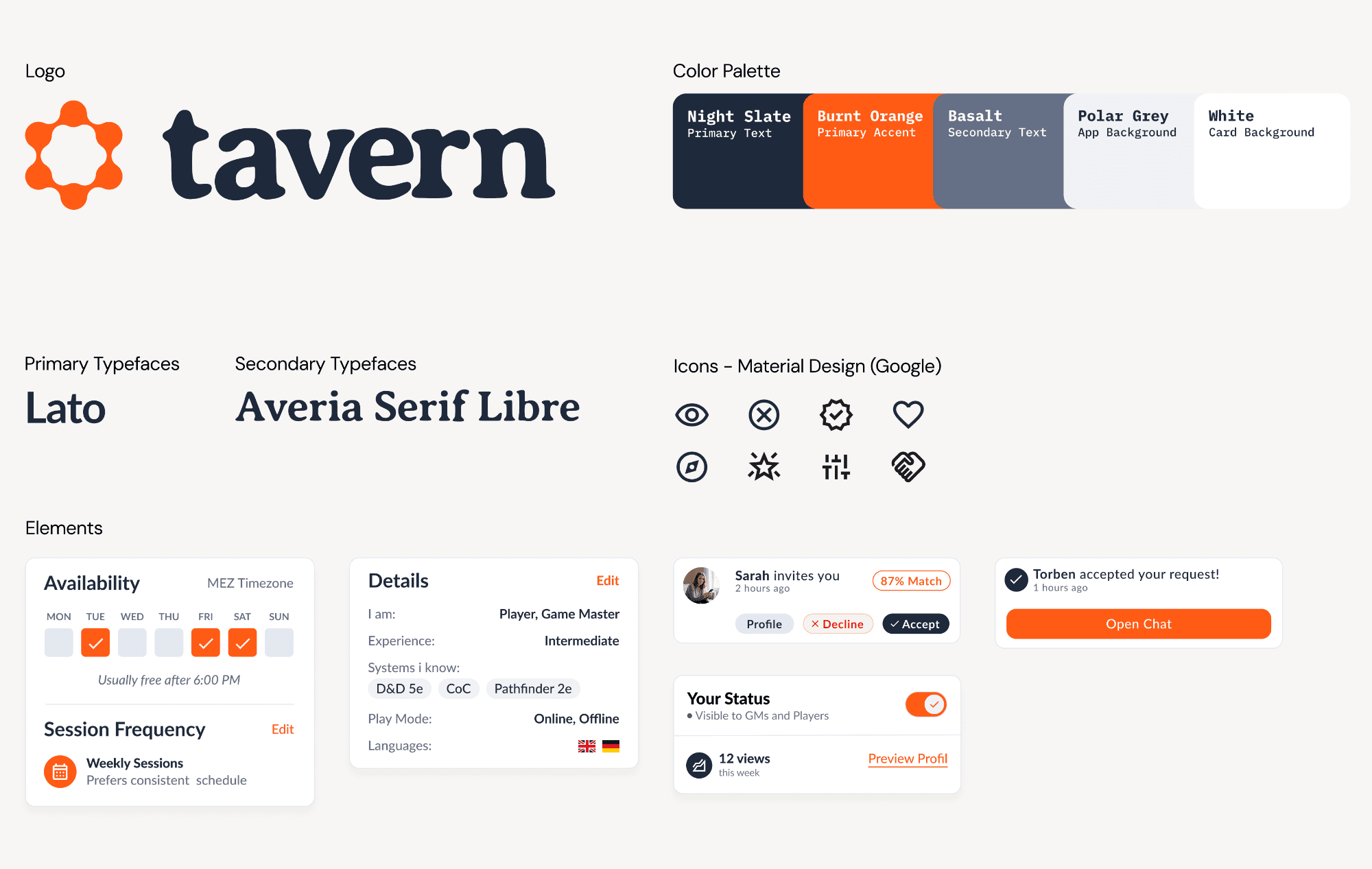
Warm, not dark. Playful, not childish.
Most gaming apps default to dark backgrounds and neon accents. Tavern goes the other way: Polar Grey and White surfaces, Night Slate text, Burnt Orange for every accent and CTA. Warm enough to feel inviting, restrained enough to stay out of the way.
Lato handles UI elements with quiet precision. Averia Serif Libre carries the brand voice in headlines, created by averaging the outlines of hundreds of fonts into one typeface, which felt fitting for an app that brings different players together. Its slight irregularity gives it a handwritten, analog quality, closer to notes on a character sheet than a corporate product.
Icons are Material Design Rounded. Components like the Availability Widget and Match Invite cards are self-contained modules: scannable alone, consistent as a system.
What broke and what I rebuilt.
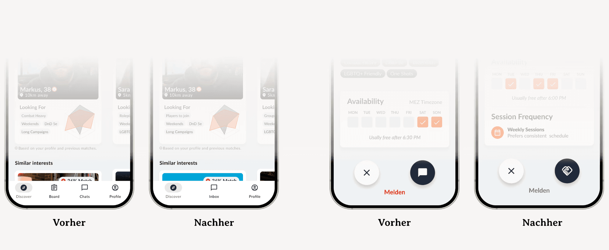
Even with a small test group, three issues surfaced immediately. The biggest: my four-tab navigation had a dedicated "Board" tab for visibility management. Nobody understood what it meant; everyone instinctively went to Profile instead. I cut the tab and moved the toggle into Profile. Result: a cleaner three-tab navigation that tested at near-perfect task completion on the second round.
Other fixes: the Connect button icon changed from an ambiguous symbol to a handshake after users hesitated on it, and a Role badge (Player/GM) was added to profile cards after testers couldn't tell who was offering what.
Measuring what matters.
Tavern doesn't measure success in downloads or sign-ups. The metric that matters is Session 3 Retention: whether a matched group is still playing after their third session, the point where strangers either become a real group or fall apart. Everything in the product optimizes for that, not a vanity dashboard.
What's validated:
Users completed the full Vibe Check without dropping off
Three-tab navigation tested cleanly after iteration
Radar Chart was intuitively understood; no tooltip needed
Survey data (n=149) confirms the problem exists and current tools don't solve it
What I'd do next:
A/B test 12 vs. 18 Vibe Check questions
Re-test with 5+ users for statistically meaningful results
Check whether low Match Scores (e.g. 55%) still feel useful or just discouraging
Explore avatar-based profiles instead of photos: better privacy, fits the aesthetic
What I'd do differently:
Interview more people before designing; the marketplace assumption could've been challenged sooner
Test the Vibe Check questions for internal consistency
Thanks for reading. If you want to talk about matchmaking systems, ethical design patterns, or why your D&D group keeps falling apart, I'd love to hear from you.